
Use All 4 Formats of Creative in One Facebook Ad Campaign: Performance Increasing Hack
Helping you stay 2.5 steps ahead of the games industry. Don't be too serious, except about UA.
Subscribe to my Brutally Honest newsletter!
Using all four creative formats in one ad campaign is a powerful hack to increase performance for mobile game promotions. Diversifying creative assets—such as videos, static images, carousels, and interactive ads—not only engages a broader audience but also improves the relevance of your campaigns across different platforms. This strategy ensures your mobile game’s appeal resonates with users who prefer varied content types, leading to higher engagement rates and better campaign results.
When implementing this approach, choosing the right size of video or image is crucial to avoid pitfalls like a weird crop that can distort visuals or messaging. Optimizing for the 4 basic creative formats ensures seamless delivery across platforms, especially on Instagram, where the preferred aspect ratio of 4:5 (1080×1350) works best for feed posts. By paying attention to these details, you can craft campaigns that not only look professional but also maximize the chances of capturing your audience’s attention effectively.
Why Choosing the Right Size of Video or Image is Best to Do?
Choosing the right size of video or image before you launch your campaign in Facebook Ads Manager is the best you can do and it helps you to squeeze in the maximum from your creative champion from every placement on Facebook, Instagram, Audience Network, etc… It gives you full control over how your videos and images are displayed. And helps you to avoid a weird crop happening that cuts off a vital part of your CTA, or a crucial part of an image to establish context which I mainly see on Instagram Feed as you can see on the screenshots below.
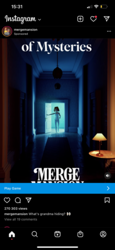
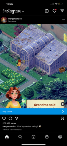
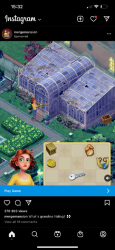
Merge Mansion used vertical format 1080×1920 for advertising for Instagram Feed. You can see a weird crop happening on the logo and also we are missing text and merge mechanics to establish context.
Having an incorrectly sized or cropped ad can be enough to have a negative impact on your campaign and this lazy extra step mistake can decrease the performance of your campaigns by lower engagement rate, especially from a cold audience.
This could possibly change by a new Instagram update where Instagram started testing a full-screen home feed last week. According to Meta, this feature would offer an instantly immersive experience, which it says is designed to “bring video more front and center.” What will at some point also reflect the display of ads on the Instagram feed. But for now, we need to hack the system and launch videos or images for the Instagram newsfeed properly.
Why does the Weird Crop Happen?
Weird crop happens because of two reasons. Two reasons are given below:
1st
This happens in small studios with a small budget or not enough production resources. That results in creative production being only about one or two formats that are used basically for everything. Vertical or horizontal because this fits almost every AdNetwork, it is time-saving and cost-saving and Facebook works with what it got.
But when you add a little more effort and create additional creative ratios you can drive outstanding results with your creative champion from all available placements.
2nd
This happens in studios that have enough resources to make all available creative formats but they make a mistake when creating a campaign and selecting a media crop for each placement or by using Advantage+ App Campaigns. Don’t get me wrong I love using Advantage+ App Campaigns as this simplified setup helps me lower cost per install and from time to time lower cost per action than a manual app install campaign setup. But you really don’t have control over which creative is used for each placement that you have in a “tailored setup” manual app install campaign setup.
So what’s the hack that can help you to increase performance and squeeze in the maximum from your creative champion?
What are the Benefits of Using All 4 Basic Creative Formats?
The benefits of using all 4 basic creative formats are as followed:
For Advantage+ App Campaigns to minimize a weird creative crop always use all of the formats you have. This helps you to squeeze in the maximum from your creatives and deliver high-performing creative variations to more relevant audiences on more effective placements. The four basic formats that you should always use to test from your creative are Square 1080×1080, Vertical 1080×1920, Horizontal 1920×1080, and Instagram format or the aspect ratio 4:5 1080×1350.
The fun begins with App Ads campaigns on Facebook. It’s the type of campaign that you can run in combination with the LAL audience which is still powerful on Android or even in combination with Interests which is worth trying for IOS14 campaigns.

Go to Add Media then select Add Video or Add Image depending on what creative you want to optimize. Select all media cropped for right placement: Square 1080×1080, Vertical 1080×1920, Horizontal 1920×1080
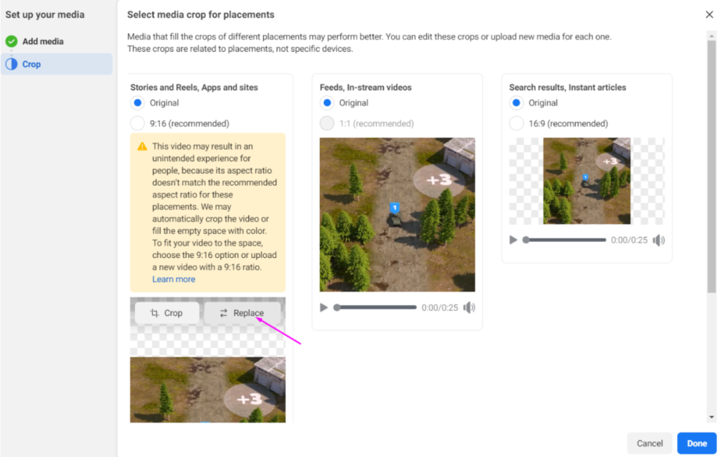
Go to Add Media then select Add Video or Add Image depending on what creative you want to optimize. I always pick the Square 1080×1080 format as the first one because of the widest range of placement support.
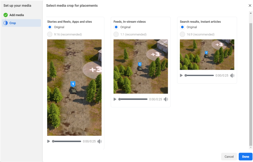
After that, your creative optimization should look like this. But we’re not done yet. This is the part when good UA guys use at best all of these formats such as square, vertical and horizontal, but the pro ones make one additional step to optimize creatives more.
How Can You Optimize Instagram and Facebook Ad Formats to Avoid Cropping Issues and Boost Campaign Performance?
To Optimize Instagram and Facebook Ad Formats to Avoid Cropping Issues and Boost Campaign Performance, you need to do following things:
For now, Facebook is a bit tricky with the “Instagram” video format and it forces you to take an extra step to properly use this video format and help to increase the performance of your campaign and avoid a weird crop from full vertical videos that cut off a vital part of your CTA, or a crucial part of an image to establish context.
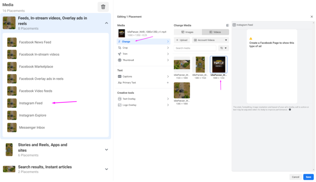
Click on the “Feeds, In-stream videos, Overlay ads in reels” and then click on the Instagram Feed and chance the classic default square format on creative with a ratio: of 4:5 or 1080x1350px.
Pro tip: Change this format also for Facebook News Feed and replace the default square format on creative with a ratio: of 4:5 or 1080x1350px. Creatives with a ratio: of 4:5 or 1080×1350 from our tests always beats the classic square format used in Instagram News Feed or even Facebook News Feed placement in terms of lower CPI and of course higher ROAS. But always make sure that the visuals are perfectly sized and cropped. It’s a simple process to ensure that your ads look perfect, and it can have a big and very profitable impact on your campaigns.
How does Facebook Lookalike Audience Help Increasing Ad Performance?
When it comes to enhancing ad performance on Facebook, the ability to reach users with high potential for engagement and conversions is key. One of the most effective ways to achieve this is by leveraging data-driven targeting techniques that focus on creating meaningful connections with audiences. This is where Facebook Lookalike Audience plays a pivotal role, allowing advertisers to expand their reach by identifying new users who share similar traits with their best-performing customer segments. By combining this advanced targeting capability with the strategic use of all four creative formats, advertisers can craft highly personalized and impactful campaigns that align with audience preferences and behavior.
Using a Facebook Lookalike Audience ensures that your ads, whether in video, carousel, static image, or interactive formats, reach users most likely to engage. For instance, a well-designed video ad optimized for the Instagram feed format (4:5 aspect ratio) can captivate attention, while a carousel ad provides a deeper dive into a mobile game’s features. Together, these formats cater to different stages of the user journey, from awareness to conversion. By targeting audiences with refined similarities and delivering creatives that are visually and contextually aligned, advertisers can avoid common pitfalls like poorly cropped visuals and mismatched messaging, ultimately driving better results in terms of lower CPI and improved ROAS.
Helping you stay 2.5 steps ahead of the games industry. Don't be too serious, except about UA.
Subscribe to my Brutally Honest newsletter!


